
How to Choose Logo Placement: The 2026 Strategic Branding Guide

A logo in the wrong place isn't just a design flaw; it's a missed connection with every customer your team meets. You've likely felt the frustration of seeing a brand-new uniform lose its professional edge because the branding was too small, off-centre, or placed where it quickly peels and fades. Understanding how to choose logo placement is the difference between a garment that's discarded after a few weeks and one that remains a proud representation of your company after fifty washes. We've spent over thirty years perfecting the art of translating digital concepts into physical workwear, and we know that strategic positioning is just as vital as the design itself.
In this 2026 guide, we'll show you how to master the technical side of branding to ensure your team stays visible and your investment stays protected. You'll learn the best locations for high-impact recognition, the specific benefits of embroidery versus printing for different garment zones, and the common mistakes that lead to premature wear. From hi-vis safety gear to premium softshell jackets, we're providing the roadmap to a uniform your staff will actually want to wear.
Key Takeaways
- Understand the "Eye-Level Rule" and why the left chest remains the global standard for building trust and immediate professional recognition.
- Learn how to choose logo placement that balances maximum brand visibility with the long-term durability of your embroidered workwear.
- Discover the "Identify and Brand" framework for seamlessly pairing branded apparel with name badges and ID cards for a cohesive team look.
- Tailor your branding strategy to your specific sector, ensuring your garments meet industry needs like hi-vis compliance or hospitality aesthetics.
- Explore how expert creative assistance can help you transition smoothly from a digital design concept to a finished, high-quality item.
Why Logo Placement is the Foundation of Professional Branding
Logo placement is far more than a simple design choice; it's the strategic positioning of your brand assets on apparel or hardware to communicate your company's values without saying a word. When you're deciding how to choose logo placement, you're essentially mapping out how a customer perceives your team's authority and attention to detail. A logo acts as a central element of a complex identification system, and its specific location on a polo shirt or jacket dictates how effectively that system functions during daily operations. In the UK business environment, where face-to-face interactions are the bedrock of trust, the "first impression" is often tied directly to how clearly your branding is displayed.
The relationship between placement and brand recall is significant. If a logo is buried or positioned awkwardly, the brain struggles to categorise the wearer as a professional representative. However, when branding follows established visual hierarchies, it creates an immediate sense of reliability. This isn't just about being seen; it's about being remembered as a safe pair of hands.
The Psychology of the Left-Chest Placement
There's a reason the left chest is the global standard for corporate identity. Humans naturally scan from left to right, making the left side of a garment the prime real estate for identity. This side is also traditionally associated with the heart, subconsciously linking your brand to loyalty and sincerity. By placing your logo here, you tap into established patterns of authority that have been used in uniforms for centuries. The handshake zone is the area most visible during professional introductions, making it the most critical spot for immediate brand recall.
Balancing Aesthetics with Functional Durability
A professional look only lasts as long as the garment itself. If a logo is placed in a high-friction area, such as near the underarms or right at the waistband where shirts are frequently tucked, the embroidery or print will degrade quickly. We always recommend avoiding seams and zips. These structural elements create uneven tension that can lead to puckering or thread breaks after just a few cycles in the wash. By choosing stable, flat surfaces, you ensure your workwear remains crisp and professional through 50 or more washes, protecting your investment and your brand's reputation.
The 5 Standard Logo Positions and When to Use Them
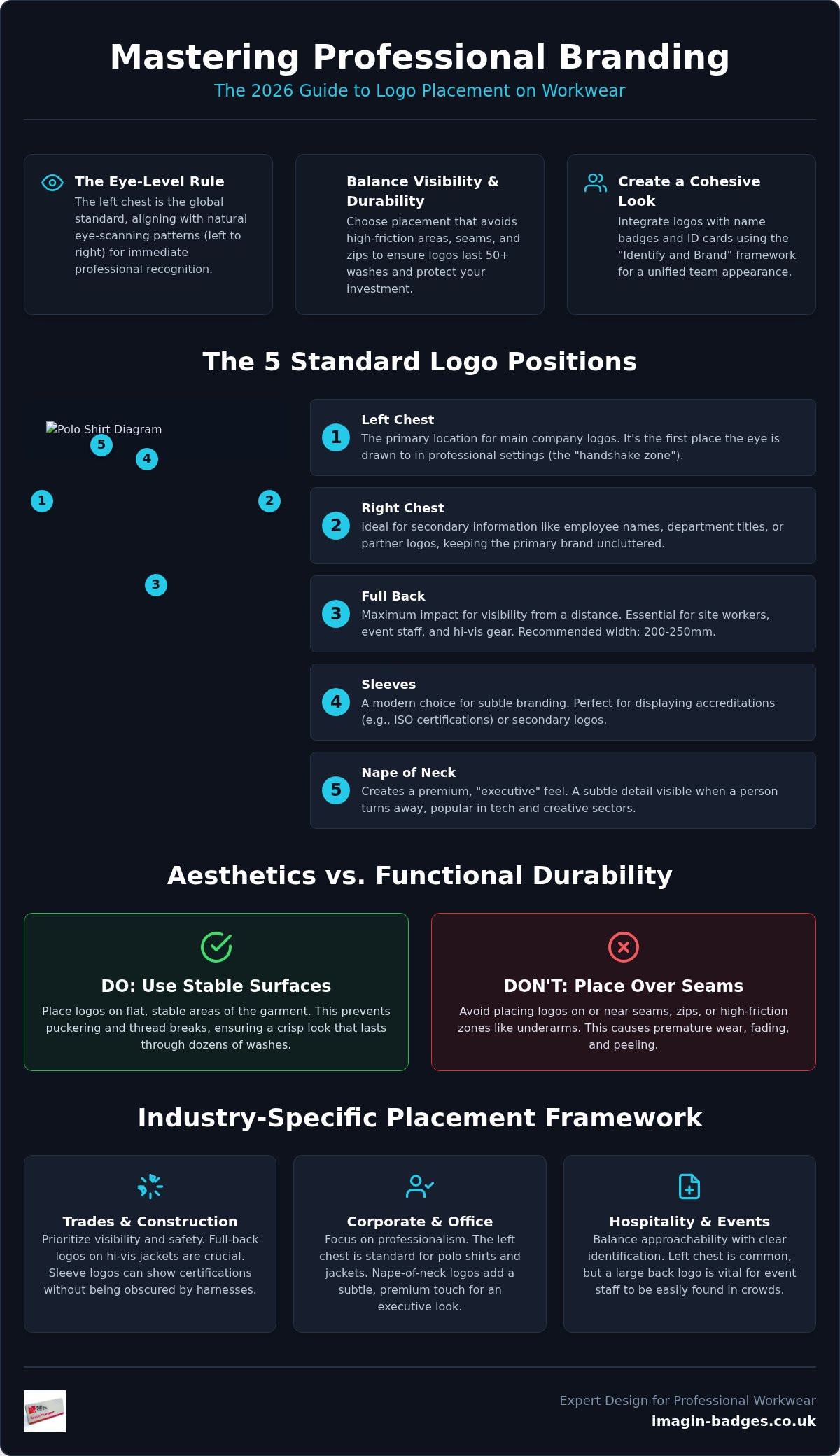
Selecting the right spot for your branding is about more than aesthetics; it's about functionality. When considering how to choose logo placement, you must evaluate the environment where the garment will be worn. Most organisations start with the left chest for their primary logo, as established in our look at professional standards. However, a truly comprehensive uniform often utilises secondary locations to build a more detailed brand story. The right chest, for instance, is traditionally reserved for individual employee names or secondary branding, such as a specific department title. This keeps the primary brand identity on the left uncluttered and easy to read.
For those looking to add a touch of modern sophistication, sleeve branding and nape-of-neck placements offer a fresh alternative to traditional layouts. Each position serves a specific purpose, from ensuring safety on a construction site to projecting an executive image in a boardroom. Our goal is to help you find the balance that keeps your team looking sharp while ensuring every logo remains durable and clear.
Maximising Visibility with Back Placements
For site-based workers, event staff, and those wearing Hi-Vis Safety Gear, the back of the garment is your most valuable real estate. A full-back logo provides maximum impact and ensures your company is identifiable from a distance. To ensure readability from at least 10 metres away, we generally recommend a minimum width of 200mm to 250mm for back prints or embroidery. This is essential for tradespeople working in public view, as it turns every team member into a mobile billboard. It's a practical solution for outdoor fleeces and waterproof jackets where front visibility might be obscured by equipment, tools, or safety harnesses.
Subtle Branding: Sleeves and Nape
Subtle branding is gaining significant traction in the UK tech and creative sectors. Placing a logo on the nape of the neck, just below the collar, creates an "executive" feel that's perfect for high-end polo shirts. It's visible when a person walks away but doesn't dominate the garment's design. Sleeve logos are equally effective for displaying accreditation, such as ISO certifications or regional trade memberships. Using tonal embroidery, where the thread colour closely matches the fabric colour, adds a premium, "luxury" feel to the uniform. This approach is ideal for corporate layering, allowing you to maintain a professional look that's sophisticated rather than loud. If you're looking for a safe pair of hands to manage these details, our complimentary creative assistance ensures your vision translates perfectly to the final item.
Integrating Logos with Name Badges and ID Cards
Many businesses focus solely on the garment, but a truly professional look requires a holistic "Identify and Brand" framework. This approach ensures that your apparel and identification hardware work in harmony rather than competing for attention. When you're determining how to choose logo placement, you must account for where the name badge or ID card will eventually sit. Standardising a "Logo-Left, Name-Right" rule is the most effective way to maintain visual balance. By keeping the permanent brand identity on the left chest and the personal identification on the right, you create a clear, symmetrical layout that's easy for customers to navigate.
Choosing reusable name badges offers significantly more flexibility than embroidering names directly onto a polo shirt or fleece. If a staff member leaves or a role changes, you don't have to discard a perfectly good piece of branded workwear. You simply update the name insert. This makes your uniform budget go much further while maintaining a crisp, professional appearance across the entire team.
The Logical Layout: Logo vs. Name Badge
Crowding an embroidered logo and a badge on the same side of a garment looks cluttered and unprofessional. It creates a visual weight that distracts the eye during a conversation. To protect the integrity of your clothing, we recommend using magnetic fasteners on all your badges. These secure the badge firmly without piercing or tearing the fabric of your embroidered polo shirts, sweatshirts, or delicate softshell jackets. Additionally, managing visual clutter is essential when your team uses lanyards. Ensure the lanyard length is adjusted so the ID card holder doesn't hang directly over your primary logo, as this obscures your branding and looks disorganised.
Consistency Across Different Identification Media
A professional appearance relies on absolute uniformity across every touchpoint. The logo displayed on your standard name badge should perfectly mirror the version on your embroidered hoodies or hi-vis gear. This consistency extends to colour matching; if your printed photo ID cards use a different shade of red than your embroidery, it subtly erodes the premium feel of your brand. A cohesive identification system across all media builds immediate client trust by signalling that your organisation is detail-oriented and highly professional. We act as a safe pair of hands to ensure these technical details, from thread colours to print gradients, remain consistent throughout your entire order.
Industry-Specific Placement Framework
Every sector operates within a unique set of physical and social constraints. When you're deciding how to choose logo placement, you must consider the specific environment where your team performs. A layout that works for a corporate office might be completely invisible in a busy commercial kitchen or ineffective on a construction site. By tailoring your branding to your industry, you ensure that your staff look professional while remaining functional and safe. We've helped thousands of organisations over the last 30 years find the exact balance required for their specific field.
For healthcare professionals, the focus shifts toward clear identification and hygiene. Subtle tunic branding paired with easily readable photo ID cards is the industry standard. Conversely, corporate events often require high-energy, bold branding on t-shirts to ensure staff are easily spotted in a crowd. Regardless of the sector, the goal is to create a cohesive look that aligns with your operational needs and builds immediate trust with your clients.
Hospitality and Retail: The Customer-Facing Standard
In hospitality, your team's appearance is a direct extension of your brand's quality. For front-of-house staff, we recommend embroidered polo shirts or shirts to provide a premium feel. Determining how to choose logo placement for hospitality often involves testing visibility from different customer angles. For aprons, branding should be centred on the chest area. This ensures maximum visibility even when staff are working behind counters or tables. It's about balancing a strong brand presence with an approachable look that doesn't overwhelm the customer. If you're looking for a safe pair of hands to guide your selection, you can view our range of custom aprons and workwear here to find the perfect fit for your venue.
Trades and Safety: High-Visibility Requirements
For tradespeople, visibility is a matter of safety and compliance. When branding hi-vis safety gear, you must adhere to EN standards to ensure the reflective strips aren't obscured. Large back logos are essential for site-based workers, as they provide identification from a distance. While embroidery is excellent for smaller chest logos, screen printing is often preferred for large back designs because it's lightweight and doesn't compromise the garment's waterproof properties. We also suggest considering shoulder branding for workers who frequently wear backpacks or tool belts, as this ensures your logo remains visible even when the chest or back is covered. Our team manages the progression from initial thought to finished item, ensuring your safety gear is both compliant and professional.
The Imagin Approach: Designing Your Cohesive Uniform System
At Imagin Products Ltd, we specialise in helping UK businesses transition smoothly from an initial "idea to item". With over 30 years of experience, we've developed a streamlined process that removes the stress from ordering branded apparel and identification hardware. Understanding how to choose logo placement is a collaborative effort. We act as your creative partner, ensuring that every technical detail, from the stitch density of your embroidery to the alignment of your name badges, reflects your brand's premium quality. Our UK-based manufacturing facility allows us to maintain strict quality control and offer rapid turnaround times for national orders, providing a reliable service you can trust.
Before you finalise your order, we recommend a quick review of your layout. Use this five-point checklist to ensure your branding is perfectly positioned:
- Visibility: Is the primary logo in the "handshake zone" for immediate recognition?
- Durability: Have you avoided high-friction areas like waistbands or underarms?
- Functionality: Does the placement allow for lanyards or tool belts without obscuring the brand?
- Symmetry: Is there a clear balance between the corporate logo and employee identification?
- Consistency: Does the placement match across different garment types, from polo shirts to hoodies?
Complimentary Creative Assistance
One of the cornerstones of our service is the complimentary creative assistance we provide to every client. Our design team doesn't just take your file and hit print; we help you determine the perfect logo size for every specific garment in your range. Translating a digital logo into high-quality embroidery requires technical expertise to ensure fine lines remain sharp and colours stay vibrant. We manage this digitisation process for you, ensuring your branding remains absolutely consistent whether it appears on a premium name badge or a softshell jacket. This end-to-end involvement ensures that the final physical object perfectly matches your creative vision.
Ready to Order? Your Next Steps
When you're ready to roll out a new staff uniform, we offer tiered pricing to support bulk orders, making large-scale branding more cost-effective. To ensure a truly cohesive look, many of our clients choose to order lanyards, ID card holders, and photo ID cards alongside their embroidered workwear. This one-stop approach guarantees that your thread colours and print gradients match perfectly across all media. Our team is here to guide you through every specification, from material choice to final finishing. Contact our expert team today for your bespoke workwear quote and let us help you build a uniform your staff will be proud to wear.
Elevating Your Brand with Strategic Positioning
Mastering how to choose logo placement ensures your team projects confidence from the very first interaction. By following the "Identify and Brand" framework, you've learned to balance the psychology of the left-chest position with the practical durability needed for daily operations. Whether you're selecting back branding for site safety or executive nape-of-neck embroidery for a corporate event, your choices now serve a strategic purpose. A well-positioned logo doesn't just look professional; it protects your investment by ensuring your workwear remains crisp and recognisable after countless washes.
We've been a safe pair of hands for UK businesses since 1990, manufacturing every item in our local facility to ensure the highest standards of craftsmanship. Our team provides complimentary creative assistance on every order, helping you translate your digital vision into a physical reality with national delivery and rapid turnaround. You don't have to navigate these technical specifications alone. Explore our full range of branded workwear and name badges to start building a uniform that truly represents your brand's excellence. We look forward to helping you realise your creative vision.
Frequently Asked Questions
Should a logo go on the left or right chest of a polo shirt?
A logo should traditionally go on the left chest because it's the primary area for brand recognition. This "heart side" placement is the global standard for building trust. It also leaves the right chest clear for a reusable name badge or personal identification. By standardising this layout, you ensure a balanced look that customers can navigate easily during professional introductions or service interactions across your team.
What is the standard size for an embroidered logo on the chest?
The standard size for an embroidered chest logo typically falls between 80mm and 100mm in width. For circular or square logos, a diameter of 60mm to 75mm is often preferred to prevent the branding from appearing too bulky on the fabric. Our design team provides complimentary creative assistance to help you scale your digital artwork perfectly for the specific material of your embroidered polo shirts or fleece jackets.
Can you put a logo on the sleeve of a jacket?
You can certainly put a logo on the sleeve of a jacket, and it's a popular choice for displaying secondary branding or trade accreditations. Placing a small, high-quality embroidered logo on the upper arm creates a modern, layered look that feels more subtle than a chest placement. It's particularly effective for corporate softshell jackets where you want to maintain a sleek, executive appearance without overcomplicating the front design.
Is it better to embroider or print a large logo on the back of a hoodie?
Screen printing is generally better than embroidery for large logos on the back of a hoodie. Heavy embroidery on a large scale can cause the fabric to pucker and feel uncomfortable against the skin during daily wear. Printing remains lightweight and flexible, allowing the garment to move naturally with the wearer. This method also ensures that large designs remain crisp and vibrant through fifty or more washes, making it ideal for site-based workers.
Where should an employee name go if the logo is on the left chest?
If your logo is on the left chest, the employee's name should go on the right chest. This creates a professional symmetry that's easy for clients to read. We recommend using a reusable name badge on the right side rather than permanent embroidery. This approach offers more flexibility for staff turnover and protects the garment from the damage often caused by pins when you use a magnetic fastener instead.
How do I choose the right logo placement for hi-vis workwear?
When deciding how to choose logo placement for hi-vis workwear, you must prioritise EN safety standards. Branding should never obscure the reflective silver tapes that ensure worker visibility on a job site. We typically recommend a small chest logo and a large back print positioned between the reflective strips. This ensures your brand remains visible without compromising the garment's protective certification or the safety of your team in high-risk environments.
Does logo placement affect the cost of branded clothing?
Logo placement does affect the final cost, as each additional location requires separate setup and production time. For example, a garment with branding on both the chest and the sleeve will involve more technical finishing than a single-position order. We offer tiered pricing for bulk uniform rollouts, which helps manage the investment when you're implementing a multi-logo strategy across your entire staff team's embroidered polo shirts or waterproof jackets.
What are the best logo positions for a professional corporate uniform?
The best logo positions for a corporate uniform are the left chest for primary identity and the nape of the neck for a subtle, executive touch. If you want to add further detail, a small sleeve logo for trade memberships or ISO certifications works well. These locations ensure your branding is visible but remains sophisticated, helping you master how to choose logo placement for a professional and cohesive team appearance across the country.