
Pantone Matching for Branded Lanyards and Promotional Items

Pantone matching for branded lanyards is worth considering when a specific brand colour matters more than choosing from standard colours. A Pantone reference provides a clear colour target, but the finished shade can vary with the material and printing process. If a close standard colour is acceptable, that may be the simpler option.
It makes sense to want lanyards to coordinate with your organisation’s other branded materials. The decision depends on how closely the colour needs to match, whether a suitable standard option is available and how the chosen material will reproduce the shade.
This guide explains when standard colours may be enough and when to provide a PANTONE® reference. It covers how colour matching works for lanyards and other promotional products, what to consider when reviewing a result, and how to prepare an order. Use these points to choose an approach that suits your design priorities before production.
Key Takeaways
- Decide how close your promotional item’s colour needs to be to your brand reference before choosing between a standard shade and a custom match.
- Before requesting a custom colour, check whether a stock product already offers a suitable match.
- Use a Pantone reference when specifying a target shade, and consider whether the reference is coated or uncoated.
- Allow for the material and printing method to affect how a colour appears on the finished item.
- For coordinated staff or event identification, consider how name badges, reusable badges and conference badges will work alongside your lanyards.
Standard Colours or PANTONE® Matching?
Choose between a standard colour and a custom match by deciding how closely each item needs to follow your organisation’s brand palette. Start by comparing the available products with the colours already used in your materials.
Checking Existing Stock Colours
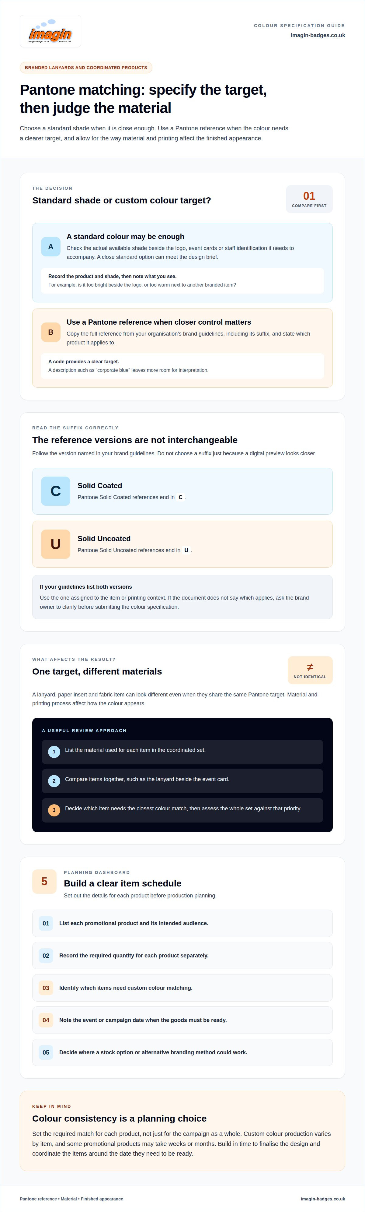
Before requesting a custom colour, check whether a standard product offers a suitable match. Compare the actual shade with the logo and materials it needs to accompany, such as event cards or staff identification. A close standard option may meet the design brief without custom colour production.
Record the product and shade you’re considering. If the colour doesn’t work, note why: it may look too bright beside the logo or too warm next to another branded item. Specific observations help distinguish a genuine mismatch from a preference for a different shade.
Using Pantone References for Brand Consistency
When standard colours aren’t close enough, use the Pantone code in your organisation’s brand guidelines. Copy the full reference, including its suffix, and specify which product it applies to. A code gives the colour brief a clear point of reference, while a description such as “corporate blue” leaves more room for interpretation.
Keep the reference with the relevant artwork and order details. If your brand guide lists several colours, mark which one should appear on each item. For example, an event pack might use one shade for lanyards and another for printed cards. Clear instructions help ensure the right colour is assigned to each product.
Choosing Coated or Uncoated References
Follow the version specified in your brand guidelines instead of choosing a suffix based on a digital preview. Pantone Solid Coated references end in “C”, while Solid Uncoated references end in “U”. Copy the suffix exactly: it identifies the intended reference and helps avoid ambiguity when the artwork and order notes are reviewed together.
If your guidelines include both versions, use the one assigned to the item or printing context. Don’t replace a listed “C” code with a “U” code because its on-screen appearance seems closer. If the document doesn’t say which applies, ask the brand owner to clarify before submitting the colour specification.
Matching Colours Across Materials
Different materials and printing processes affect how a colour appears. A lanyard, paper insert and fabric item can therefore look different, even if they share the same Pantone target. List the material for each item in a coordinated set, then assess whether the overall appearance works together.
For example, compare the lanyard with the event card it will accompany instead of approving each product in isolation. Decide which item needs the closest colour match. This gives reviewers a practical basis for assessing the set and keeps approval focused on its intended use.
Pantone-matched promotional products
Plan Pantone-matched promotional products as one coordinated project rather than as separate purchases. List each item, its purpose and where people will encounter it. A conference pack, for instance, might include lanyards for delegates and bags for materials. A staff campaign could pair lanyards with other branded merchandise. This list helps clarify which items need a close colour match and which simply need to fit the wider design.
Quantity is an important planning decision, and it varies between products and suppliers. Set the expected quantity for each item separately, rather than adding all products together as though they share one minimum. Confirm order quantities and lead times directly with Imagin.
Production timing varies between promotional products, and colour matching for some merchandise can take a number of weeks or months. If your items are for a conference or launch, factor this into the event plan. Work backwards from the date the goods need to be ready for distribution, allowing time to finalise the design and coordinate products. Don’t assume every item in a campaign follows the same production schedule.
Give each product a clear role in the set. A lanyard may be worn throughout an event, while a bag carries information away afterwards. The design brief should account for how the logo and colour appear on each item and how recipients will use it. A conference organiser, for example, may prioritise recognisable delegate lanyards, with bags serving as supporting takeaways. This keeps design decisions relevant to each product’s purpose.
Before production planning, prepare a simple item schedule:
- List each promotional product and its intended audience.
- Record the required quantity for each product separately.
- Identify which items need custom colour matching.
- Note the event or campaign date when the goods must be ready.
- Decide where an alternative branding method or stock option could work.
For a mixed order, decide whether every item must share the same level of colour matching. A custom-dyed fabric bag may involve a very different quantity from a set of lanyards, so treating the products as separate decisions can make the scope clearer. Where an item’s quantity is small, consider an alternative approach for it while keeping the campaign visually coordinated. This lets the brief balance quantity, production timing and the intended role of each promotional product.
Pantone-matched branded lanyards
There isn’t one fixed UK price for Pantone-matched lanyards. The order cost depends on the quantity and specification, so the colour reference alone isn’t enough to calculate it. To compare quotes, give each supplier the same requirements, including quantity and lanyard configuration.
Factor your attendee or staff count into the order before planning custom colours. For a conference, you might need lanyards for delegates, staff and speakers. Decide whether each group needs the same design or a distinct identification treatment, then calculate the quantity required for each version.
Check the product details as well as the colour. Imagin’s personalised lanyards use double-sided dye-sublimation printing on recycled PET fabric, with a metal trigger clip and safety breakaway. Contact Imagin to discuss whether your required Pantone shade can be reproduced. Full-colour printing does not automatically guarantee Pantone matching, so include the Pantone reference and colour target in your specification. Include the attachment and breakaway in your specification if they matter to your project.
Prepare the artwork with its use in mind. A lanyard is a narrow strip, so consider how the logo, organisation name or event wording will read along its length. Decide which element should stand out and whether the design needs to repeat. Keep the final artwork aligned with the written specification so the approved design represents the item you intend to order.
- The quantity required.
- The Pantone colour reference selected for the lanyard.
- Whether the colour target applies to the strap background, the printed logo or the attachment.
- The required attachment and safety features.
- The logo, wording and intended layout.
- The event or workplace purpose and any distinct user groups.
For an event order, list quantities by role before combining them into the overall requirement. For example, record delegate, staff and speaker lanyards separately, even if they share a colour. This makes it easier to spot missing groups and check whether one design works for everyone. If different roles need different wording or artwork, show each version clearly in the brief.
When comparing quotes, check that each covers the same quantity and specification. A quote for a different width or attachment isn’t directly comparable. Keep the final approved details together for reordering, so your team has a clear record of the selected design and configuration.
There is no fixed UK price; the cost depends on the order quantity and lanyard specification.
Should lanyard colours be specified using Pantone Solid Coated or Uncoated?
Use the Pantone version stated in your brand guidelines. A reference ending in “C” means Solid Coated; “U” means Solid Uncoated. For example, Pantone 2935C and Pantone 2935U are not interchangeable instructions. Copy the complete code exactly, including its suffix, when preparing your lanyard colour brief.
These suffixes identify Pantone colour references, not the lanyard’s finish. “C” doesn’t mean the finished fabric needs a glossy coating, and “U” doesn’t require uncoated fabric. The references are displayed on different paper stocks, so they look different. A lanyard’s material and printing process also affect its final colour.
Check your organisation’s brand guide before choosing a version. If it specifies Pantone Solid Coated, use that code rather than selecting an Uncoated alternative because its swatch looks closer on screen. A digital preview isn’t a reliable way to choose between Pantone references. Keep the official code as the production target, then assess how the chosen lanyard material reproduces it.
If your guidelines show both versions, identify which one applies to the item. For instance, your logo artwork might use Pantone 2935C, while another document lists Pantone 2935U. Don’t combine those references in one order without clarifying the intended target. Record the chosen code beside the product and artwork, so the lanyard request remains unambiguous.
Use this short check before submitting your specification:
- Find the Pantone code in your current brand guidelines.
- Copy the full reference, including the complete suffix.
- Check that the artwork and order notes use the same version.
- List the lanyard material and any other products requiring coordination.
- Review the proposed colour on the intended item, not only on screen.
If your brand guide has no suffix, don’t add one by guessing. Ask the brand owner which Pantone system and reference should guide production. If your organisation has a physical Pantone guide, compare its specified reference directly instead of choosing a code from a monitor. This keeps the colour instruction consistent across departments and future orders.
Confirm which Pantone system and suffix your supplier accepts. Textile references can include suffixes such as TCX rather than solely C or U, so check which one applies. Also specify whether the colour target applies to the strap background, the printed logo or the attachment.
For a set containing lanyards and printed paper materials, one Pantone reference can guide both, but their surfaces won’t look identical. Paper stock, lanyard material and printing all affect appearance. Give the production team the approved code and intended use, then review the lanyard as a finished product on its actual material and print process.
How accurately can lanyard manufacturers match Pantone colours?
A Pantone reference gives the manufacturer a defined colour target, not a guarantee that the finished lanyard will look identical to a swatch. Material and printing affect the visible result. Assess the Pantone code alongside the fabric, production method and any other products you want to coordinate.
Start with the complete reference from your brand guidelines, including its suffix. For example, Pantone 2935C is a specific rich blue reference. Include that code in your artwork notes rather than relying on a screen image or a description such as “royal blue”. RGB and CMYK values serve different colour workflows and don’t replace a Pantone reference for this matching request.
Next, consider the intended lanyard material. A colour on fabric won’t necessarily look the same as it does on paper or another promotional product. Printing also affects the result. One Pantone target can guide a coordinated set without producing an identical appearance on every surface. Compare the lanyard with the items it needs to sit beside, such as a delegate card or event signage.
Set your priority before reviewing the colour. Is the main aim to match your organisation’s reference as closely as the lanyard material allows, or to create a consistent appearance across several products? These goals can lead to different choices. A lanyard may look slightly different from a paper card yet still work well within the same brand palette.
To make your colour brief clear, include these details:
- The full Pantone reference, including the complete suffix.
- The lanyard material and printing requirements.
- Any related products that need to coordinate.
- Whether your priority is the lanyard shade or the appearance of the full set.
- The physical brand reference or approved colour standard your team uses.
When comparing a proposed colour, assess it under consistent lighting and beside the intended materials. A monitor may display the same code differently from a printed or fabric surface. Keep the approved reference with the final artwork and order details. This gives future orders a consistent starting point, although material and printing still affect the finished colour.
For a custom colour brief, provide a Pantone reference and describe the lanyard material and its role in your wider branded set. This gives the colour decision a clear basis instead of relying on a vague colour name or digital preview.
Imagin Products: Standard Name Badges
Imagin Products Ltd offers branded lanyards and Standard Name Badges to support clear staff identification. If the lanyard colour is part of a wider identity scheme, consider how the badge design will sit alongside it. A coordinated set can help identify staff at conferences, workplaces and events.
Choose Standard Name Badges for straightforward staff identification. Premium Name Badges offer another option, while Reusable Name Badges suit situations where names need to change. Conference Badges can support event-specific delegate identification. Each serves a different purpose, so consider who will wear it and what information they need to display.
Explore Standard Name Badges or contact Imagin Products Ltd to discuss the right option for your identification needs.
Turn your colour brief into a coordinated design
Use your chosen colour approach as part of a wider identification plan. Before ordering, bring together the lanyard design, the products it needs to complement and your team’s brand references. This gives everyone reviewing the design the same point of reference, from the person approving the artwork to colleagues preparing event materials.
Pantone matching for branded lanyards is most useful when a defined brand shade matters to the finished design. Keep the colour reference with the artwork and note which products should coordinate. Then consider how identification will work in practice, including what information to display and who will wear it. A clear brief helps turn these decisions into a consistent set of branded items.
When you’re ready to develop your design, Imagin Products can help you find suitable identification products for your organisation. Start with the requirements you’ve already established, and take the next step at a pace that suits your project.
Frequently Asked Questions
Planning a PANTONE® Matched Lanyard Order?
Begin with the approved colour reference and the lanyard’s intended use. For an event, note how the lanyard will sit beside delegate cards, signage or staff clothing. Record the material, design requirements and quantity in one brief. Keeping these details together helps prevent different teams using different colour references or product requirements.
How do you match a Pantone colour for a branded lanyard?
Provide the complete Pantone reference from your brand guidelines, including its suffix, and identify the lanyard material. A colour code gives production a defined target, while a vague description such as “dark blue” leaves room for interpretation. Keep the artwork and colour instruction together. For example, if the logo file uses a Pantone reference, make sure the order brief names the same one.
How do printed and woven branding affect colour matching?
Polyester is a fibre, while woven describes how a lanyard is constructed, so woven lanyards can also be polyester. The more useful comparison is between printed branding and woven branding. With dye-sublimation, the colour is absorbed into the polyester fibres of the strap, while woven designs are built into the fabric, so the same Pantone reference may not look identical on both. Compare the proposed shade on the intended branding method, and decide whether the priority is matching a reference closely or coordinating with other event materials.
What is the minimum order quantity for custom Pantone-matched lanyards in the UK?
Minimum order quantities depend on the product and specification. If your requirement is small, consider whether a standard colour would meet the design brief instead. For example, an event needing a smaller delegate group might use an existing lanyard shade alongside matching printed cards.
Can you request a physical colour proof or sample before ordering lanyards?
A generic product sample shows the lanyard’s material and build, but it is not a custom colour proof made in your approved colour. A custom colour proof shows your shade on the actual material using your approved production method. Confirm the availability, costs and lead times for a physical sample made using your approved colour and production method. Treat colour approval and artwork approval as separate checks: one concerns the shade, the other the logo’s position and appearance.
How should Pantone colours be supplied when ordering custom lanyards?
Copy the full Pantone code from your brand guidelines, including “C” or “U” where shown. Identify the logo version that uses it and specify which lanyard the reference applies to. If your organisation has several brand colours, mark the required one clearly rather than sending a palette without instructions. Keep the code in both the artwork notes and written order details.
What colour variations and matching limitations should buyers expect?
Expect the material and printing process to affect the finished appearance. Pantone matching sets a target, but it doesn’t make a fabric lanyard identical to a paper swatch or another product. Decide whether the lanyard needs to match the reference closely or coordinate with other branded items. Assess it in the context where people will see and wear it.
How do print method and lanyard material affect logo and Pantone colour matching?
The printing process and lanyard material both influence colour reproduction. They also affect how the logo appears on the finished strap, so assess the artwork and background colour together. A logo designed for a pale surface, for example, may need a different contrast approach on a dark lanyard. Include the intended material, logo colours and reference code in one production brief.
Article by
Team Imagin :)
Team Imagin helps businesses look their best with quality name badges, photo ID cards, lanyards and branded workwear. Based in Kirkcaldy, Scotland, we combine friendly, personal service with professional printing and embroidery to bring your branding to life. From small teams to large organisations across Scotland, the UK, Europe and America, we help you boost your brand and build connections.
Disclaimer
This article provides general guidance only. Information was correct to the best of our knowledge when published, but product details, prices and regulations may change. Check current specifications and official guidance before making decisions.