
Name Badge Design Mistakes to Avoid for Clear, Useful Badges

The main name badge design mistakes to avoid are choices that make a badge harder to read or less useful for the wearer. A good design balances identification, workplace or event needs, and your organisation’s visual identity. Set those priorities early so decorative details don’t distract from the badge’s purpose.
The badge format and fastening also affect the design. The layout needs to work on the finished physical badge, not just on screen. Keep this in mind when checking whether it will suit staff introductions, customer-facing roles, or event use.
This guide offers a practical way to shape and review your design, from deciding what belongs on the badge to preparing artwork for approval. You’ll find advice on making considered choices, spotting issues before production and creating a badge that feels consistent with your organisation. Use the points that fit your needs to develop a clear brief and move towards a design that works in practice.
Key Takeaways
- Use clear contrast and a simple background so names remain easy to read.
- Include only details attendees need, and give the person’s name the strongest visual emphasis.
- Adapt templates and icons to your organisation instead of letting decorative elements crowd the badge.
- Proofread names, dates and event details carefully before approving the design.
- Simplify logos so their key shapes and lettering still read clearly at badge size.
1. What Are the Best Practices and Common Mistakes to Avoid When Designing My First Name Badge?
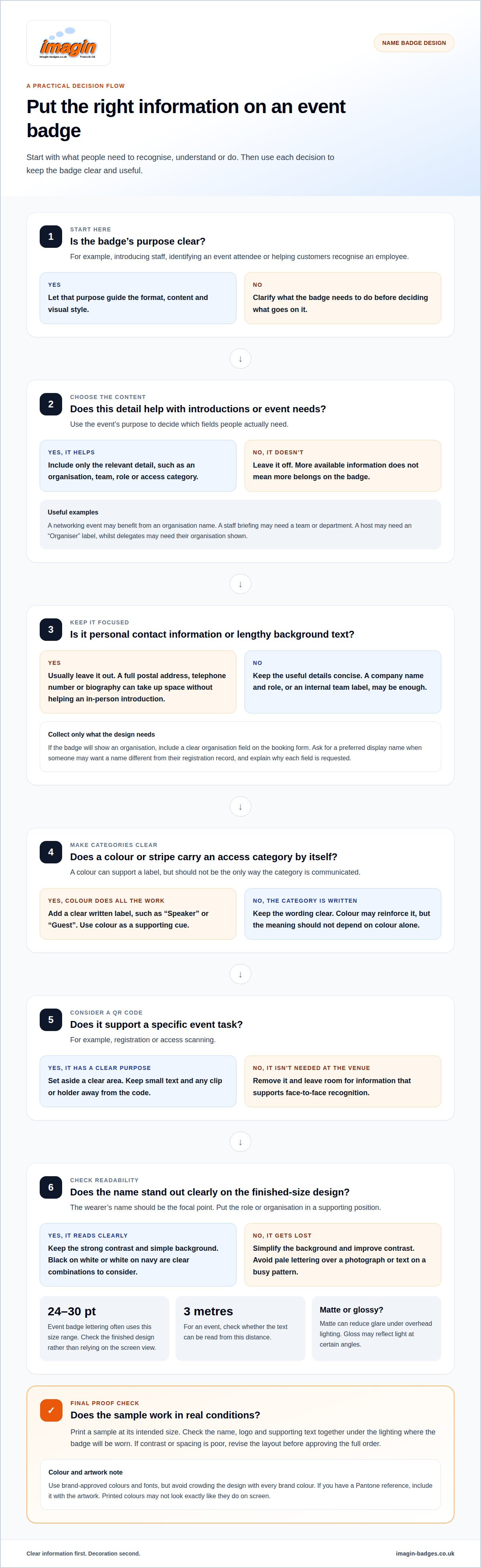
Start by defining the badge’s purpose: introducing a staff member, identifying an event attendee, or helping customers recognise an employee. That purpose should guide its format, content, and visual style. Make the wearer’s name the focal point, with their role or organisation in a supporting position. A receptionist’s name, for example, should stand out before a decorative border or logo.
Strong contrast makes text easier to read. Black on white and white on navy are clear combinations to consider. Avoid pale lettering over a photograph or text on a busy pattern, where parts of a name may disappear. A single background colour or subtle tint keeps the design calm and the name easy to find.
Using brand-approved colours and fonts helps create a consistent identity, but applying every brand colour at once can crowd a small design. Choose one main background colour and reserve others for the logo or supporting details. If your organisation has a Pantone reference, include it with the artwork to give production a clearer colour target than a screenshot. Bear in mind that printed colours may not look exactly like they do on screen.
Check the chosen format at its actual printed size. A bold, simple sans-serif typeface is a practical option for names, and event badge designs often use 24-30 pt lettering. View a test at the distance people will read it. For an event, checking from three metres away can reveal text that looks clear on a screen but becomes difficult to read on the badge.
Printing, engraving, and reusable formats suit different needs. Printing works well for colour and detailed artwork. Engraving creates a mark cut into the surface, with the result depending on the material and contrast. Reusable badges let you change the name insert when names vary. Keep the insert layout simple, with readable text.
Consider how light reflects off the badge. A matte finish can reduce glare, particularly under overhead lighting, while a glossy surface may reflect light at certain angles and make text harder to read. Assess the finish alongside contrast and the conditions in which people will view the badge.
Before approval, print a sample at its intended size and check it under the lighting where it will be worn. Review the name, logo, and supporting text together. A layout that looks balanced on a bright monitor may appear different in reception lighting or an event hall. Testing can reveal poor contrast and cramped spacing before the full order is printed.
2. Providing attendees with relevant information
A badge should include the information people need at the event. Before asking for registration details, decide whether attendees need to identify one another, find a particular team, or show an access category. A networking breakfast may benefit from an organisation name, while a staff briefing may need a team or department. Let the event’s purpose determine the fields, not the amount of information available.
Build your data collection around the fields you’ve chosen. If an attendee’s organisation will appear, include a clear organisation field on the booking form. Ask for the preferred display name if registration records use formal names. This gives the design team usable text without guessing whether “Elizabeth” should appear as “Liz”. Explain why you’re requesting each field so people provide relevant information rather than unrelated notes.
Keep optional content genuinely optional. An in-person introduction rarely calls for a full postal address, telephone number, or biography. These details take up space and may expose information attendees don’t need to share. For a trade event, a company name and concise role may be enough to start a conversation. For an internal session, a team label may be more useful than the employer’s full registered name.
Label special categories clearly. If attendees are grouped by access level, use words such as “Speaker” or “Guest” rather than relying on a coloured stripe alone. Colour can reinforce the label, but shouldn’t carry the meaning by itself. This makes the badge easier to understand for people who can’t distinguish the colours used.
Add a QR code only when it supports a specific event task, such as registration or access scanning. Set aside a clear area and leave enough space around the code for scanning. Don’t place small text across it or where a clip or holder could cover it. If the code isn’t needed at the venue, removing it leaves more room for information that supports face-to-face recognition.
A simple content plan helps keep the artwork focused:
- Essential: the display name and the details needed for introductions.
- Purpose-specific: an organisation, team, role or clearly written access category.
- Usually unnecessary: personal contact details or lengthy background text.
Decide whether every attendee needs the same fields. A host may need an “Organiser” label, while delegates need their organisation shown. Keep exceptions deliberate and limited rather than adding extra information to every badge. A consistent data plan also makes attendee records easier to prepare and keeps each badge focused on its purpose, rather than turning it into a miniature programme.
3. Avoiding trends, templates, and stock icons
A template is a starting layout, not a finished design. Replace sample wording, colours, and decorative elements with details that suit your organisation. A café badge, for example, might need a name and role, while a conference badge may need the attendee’s organisation. Leaving irrelevant sample text in place can make the design feel generic.
Be selective about trends. A gradient, outline font, or decorative shape may look striking on screen but compete with names when reduced to badge size. Consider what each element contributes. If a fashionable pattern makes the name harder to find, remove it. The design should draw attention to the person, not the decoration.
Scrutinise stock icons too. A telephone symbol suggests contact details, while a star might imply a rating or achievement. If an icon has no clear meaning for staff or attendees, it adds visual noise. Choose symbols with a specific purpose, and pair unfamiliar ones with a short label instead of assuming everyone will interpret them the same way.
Set consistent rules for your template. Fix the position and order of the name, organisation, and role across all badges. This helps people know where to look, even when names or job titles vary. Allow room for longer entries such as “Alexandra MacDonald” or “Visitor Experience Coordinator”, without letting text run into the logo or edge.
Test a template with realistic examples before using it for a whole team or event. Include a short name, a longer name, a compact company name, and a longer job title. Check for uneven spacing, awkward line breaks, and symbols that become unclear at the final size. A template that works for “Sam Lee” may fail with a longer name.
Review the design as a physical badge, not just a digital file. Print a test sheet at the intended size and view it under the lighting used at the event or workplace. Check that names, icons, and logos remain legible. Then fit a sample into its intended holder or wear it with the planned attachment, since the physical format may affect what remains visible.
Save the approved template as the master file for future updates. Record the selected fonts, colours, logo position, and text fields so later edits don’t introduce a different style by accident. Update the master when roles or event details change instead of saving several near-identical versions. A controlled template keeps badges recognisable while allowing for the information each person needs.
4. Proofreading names and event details
Proofread the attendee list before turning it into badge artwork. Check each first name, surname, organisation, and job title against the registration record. Names such as “Anne-Marie” and “MacLeod” can be changed accidentally when copied. Review the list at least twice before the event, then ask another person to check the final version with fresh eyes.
Keep your data structured. Put names, organisations, and roles in separate spreadsheet columns rather than combining them in one cell. Remove merged cells and check that special characters display correctly. An apostrophe or accented letter, for example, might be replaced during file transfer, making a name incorrect or harder to read.
Proofread the event details as carefully as attendee names. Compare the event title, venue, date, web address and any access wording with the approved source. A date such as “12 June” can be mistaken for “21 June” during a quick review. Check each line against the event information, rather than relying on memory or an older template.
- Names: check spelling, capitalisation, hyphens and any preferred name.
- Event details: confirm the title, date, venue and web address.
- Artwork choices: compare colours, size, quantity, finish and backing with the order.
- Production: confirm the approved layout and delivery deadline before sign-off.
Review the proof at the intended badge size. Look for awkwardly wrapped names, text too close to an edge, and details that are difficult to distinguish. Check that colour references match the approved design, especially if versions use different backgrounds. A thorough proof review covers spelling, dates, names, colours, quantities, size, plating, backing, and delivery deadline.
Request a supplier proof and allow an authorised person to approve it before printing begins. Compare it with the final attendee list, not an earlier draft. If a name or event detail changes after sign-off, update the artwork and review the revised proof. Approval of an old version doesn’t approve different content.
Keep a clear record of sign-off. Note the attendee list and artwork version that were approved, along with who approved them. For a conference, this helps resolve questions about a late name change or outdated venue detail. These checks take care, but they help catch errors before badges are printed.
5. Avoiding overcomplicated logo designs
Size and position the logo so it supports the wearer’s name rather than competing with it. Place it beside or below the name, with clear space around both. The right dimensions depend on the badge format, logo proportions, and lettering, so assess the artwork at its actual printed size.
A logo designed for a website header may contain details that disappear on a small badge. Fine lines, a long strapline, and tiny lettering can merge when reduced. Keep a recognisable symbol and remove the strapline if it becomes hard to read. Preserve the logo’s key shapes rather than squeezing every detail into the available space.
One of the common mistakes is treating every part of a brand mark as essential at every size. A detailed crest, small date and motto might work on a large sign, but crowd a 25 mm badge. Simplify the artwork for that format, while retaining the distinctive feature that helps people recognise the organisation.
Test the logo at the intended badge dimensions, not just on a computer screen. Check whether the name, symbol and any lettering remain distinct together. Then view the design from the distance at which people will read the badge. The provided design research suggests checking whether a logo’s main shapes remain clear from 5-10 metres, though a closer viewing distance may better reflect everyday badge use.
Keep the background behind a logo simple. A transparent or plain background can avoid an unwanted box around the artwork, while a contrasting block may work if it’s part of the approved brand design. Avoid placing a detailed logo over a photograph or busy pattern, where competing edges and colours can make it harder to recognise.
Before preparing the final layout, consider these practical checks:
- Keep the logo in proportion when resizing, rather than stretching it wider or taller.
- Check small text and fine details at the final badge size.
- Leave clear space between the logo, name and badge edges.
- Compare the artwork with the approved brand version, including its colours and background.
Check how the logo looks alongside names of different lengths. A short name such as “Ali Khan” leaves more open space than “Alexandra MacDonald”. Test both in the same template. Adjust spacing or logo placement consistently instead of enlarging the logo to fill the space beside shorter names.
A clear badge design uses the logo as a supporting brand cue, not the main message. If it attracts attention before the name, reduce its visual weight or simplify its details. A small-size proof helps you assess that balance before printing.
Imagin Products Ltd
Imagin Products Ltd supplies personalised name badges for organisations that need clear staff identification or event credentials. The range includes Standard Name Badges, Premium Name Badges, Reusable Name Badges, and Conference Badges, with formats suited to different identification needs.
If you're preparing artwork, the design principles above can help you prioritise names, useful details and a logo that reads well at badge size. Our team can help you shape your ideas into a clear badge design and choose an appropriate format for your organisation or event.
Contact Imagin Products Ltd to discuss your badge design and requirements.
Turn your badge idea into a clear design brief
Before turning a draft into an order, decide what success means for the people wearing and reading the badge. A concise design brief can record its purpose, required information, approved brand assets, and any details that may still change. It gives each design decision a clear reference point and helps avoid assumptions and repeated revisions.
Use these name badge design mistakes to avoid as prompts for your brief, not limits on creativity. A distinctive design can still reflect your organisation when clarity guides your choices. Leave room to adapt the layout as names, roles, or event requirements change, while keeping the core identity consistent.
A considered brief is a practical starting point, whether you’re creating badges for a team or preparing for an event. Take your idea forward with confidence: a clear purpose gives the finished design direction.
Frequently Asked Questions
Do holders and clips really affect layout that much?
Yes. An attachment or holder can cover part of the printed area or change how the badge sits. Leave clearance around the edges and keep names and essential details away from places a clip could obscure. For example, some attachments may hide a corner logo. Test the design with the intended holder or clip fitted, not just as a flat artwork file.
What are the best practices and common mistakes to avoid when designing my first name badge?
Start with one clear purpose, such as introducing staff to customers or identifying delegates at a meeting. Decide which details support that purpose and arrange them consistently. A receptionist’s badge might need a name and role, while a visitor badge may need another label. Don’t start with decoration. Make room for real names and your organisation’s approved identity in the first draft.
What photo issues should I check when designing workplace badges?
A poorly cropped or unclear photograph can make workplace badges look inconsistent and reduce the image’s usefulness. Use a current, well-lit head-and-shoulders photograph, with the face unobstructed and framed consistently across staff badges. Avoid mixing close-up portraits with full-body images, for example. Check that the final crop shows the face clearly in the badge layout, rather than relying on the original image alone.
What are the most common name badge design mistakes to avoid?
Common problems include crowding the badge with secondary details, shrinking text to fit, stretching a logo, and approving artwork without reviewing it at final size. A layout that works for short names but not longer ones is another easy-to-miss issue. Test a realistic range of names and roles, then check the approved artwork against the final specification before printing.
What font size and typeface are easiest to read on a name badge?
A clear sans-serif typeface, such as Arial or Helvetica, is a practical choice because its letterforms are straightforward. Use a font size that remains readable on the finished badge, rather than selecting a number from a screen preview. Print a sample at actual size and check letters such as “I”, “l” and “1”, which can look similar in some fonts. Avoid decorative scripts for names.
How much information should you include on a name badge?
Include only details that help someone address the wearer or understand their role. A staff badge might show a name and department; an event badge could add the attendee’s organisation. Leave out personal contact details and long slogans unless they serve a clear purpose. Try removing one line at a time and ask whether the badge still does its job.
What are the best colour contrast and colour combinations for readable name badges?
Choose text and background colours that are easy to distinguish, then review them in the intended print format. Colours that look distinct on a bright monitor may appear different when printed. Check names and small supporting text, not just the logo. If role colours are used, add a written role label so the meaning doesn’t depend on colour alone.
How should badge size and layout accommodate long names and job titles?
Allow for the longest likely name and role before finalising the layout. A line break can make a long title clearer; keep the name on its own line instead of compressing every element. A template tested only with “Sam Lee” may not suit “Alexandra MacDonald”. If the badge still feels crowded, remove optional wording rather than shrinking the text until it’s difficult to read.
Article by
Team Imagin :)
Team Imagin helps businesses look their best with quality name badges, photo ID cards, lanyards and branded workwear. Based in Kirkcaldy, Scotland, we combine friendly, personal service with professional printing and embroidery to bring your branding to life. From small teams to large organisations across Scotland, the UK, Europe and America, we help you boost your brand and build connections.
Disclaimer
This article provides general guidance only. Information was correct to the best of our knowledge when published, but product details, prices and regulations may change. Check current specifications and official guidance before making decisions.