
ID Badge Design Tips: Creating Professional Identification for Your Team in 2026

Could a single piece of plastic be the weakest link in your organization's security and brand image? It is a common frustration to spend hours on a digital layout only to receive a batch of badges that look cluttered, feel "cheap," or feature photos that are inexplicably blurry. You want your team to feel a sense of pride when they clip on their identification, not embarrassment. We understand that translating a creative vision into a functional, durable product requires more than just a logo and a printer.
In this guide, we share expert id badge design tips to help you master the balance of visual hierarchy, physical durability, and technical precision for 2026. You'll learn how to implement essential security features while adhering to the latest UK GDPR data minimisation principles. We'll also cover the practicalities that often get overlooked, such as maintaining a 5mm "safe zone" for lanyard slots and ensuring font sizes stay at a legible 10pt for names. From selecting premium materials to finalising a template that prints perfectly every time, we're here to guide you through every step of the manufacturing journey.
Key Takeaways
- Learn how to apply the "5-foot rule" to your layout, ensuring that critical identification details remain readable from a safe distance.
- Discover essential id badge design tips for integrating barcodes and QR codes into your visual aesthetic without sacrificing professional branding.
- Understand the technical differences between horizontal and vertical orientations to choose the best format for your team’s daily roles and hardware.
- Master the manufacturing requirements for edge-to-edge printing, including the correct use of CMYK profiles and bleed margins for a perfect finish.
- Explore how to use color-coding and high-contrast schemes to enhance security and streamline access across different departments or zones.
Essential ID Badge Design Principles for Professional Branding
An effective ID badge does more than sit in a plastic holder. It serves as a dual-purpose tool, acting as both a critical security checkpoint and a mobile brand ambassador. While the history of identity documents shows a progression from simple paper slips to complex biometric systems, the core requirement remains the same: immediate, reliable identification. When you follow established id badge design tips, you ensure your team looks professional while maintaining a secure environment. Consistency across your organization doesn't just look tidy. It builds a foundation of trust with clients and employees who can instantly recognize authorized personnel.
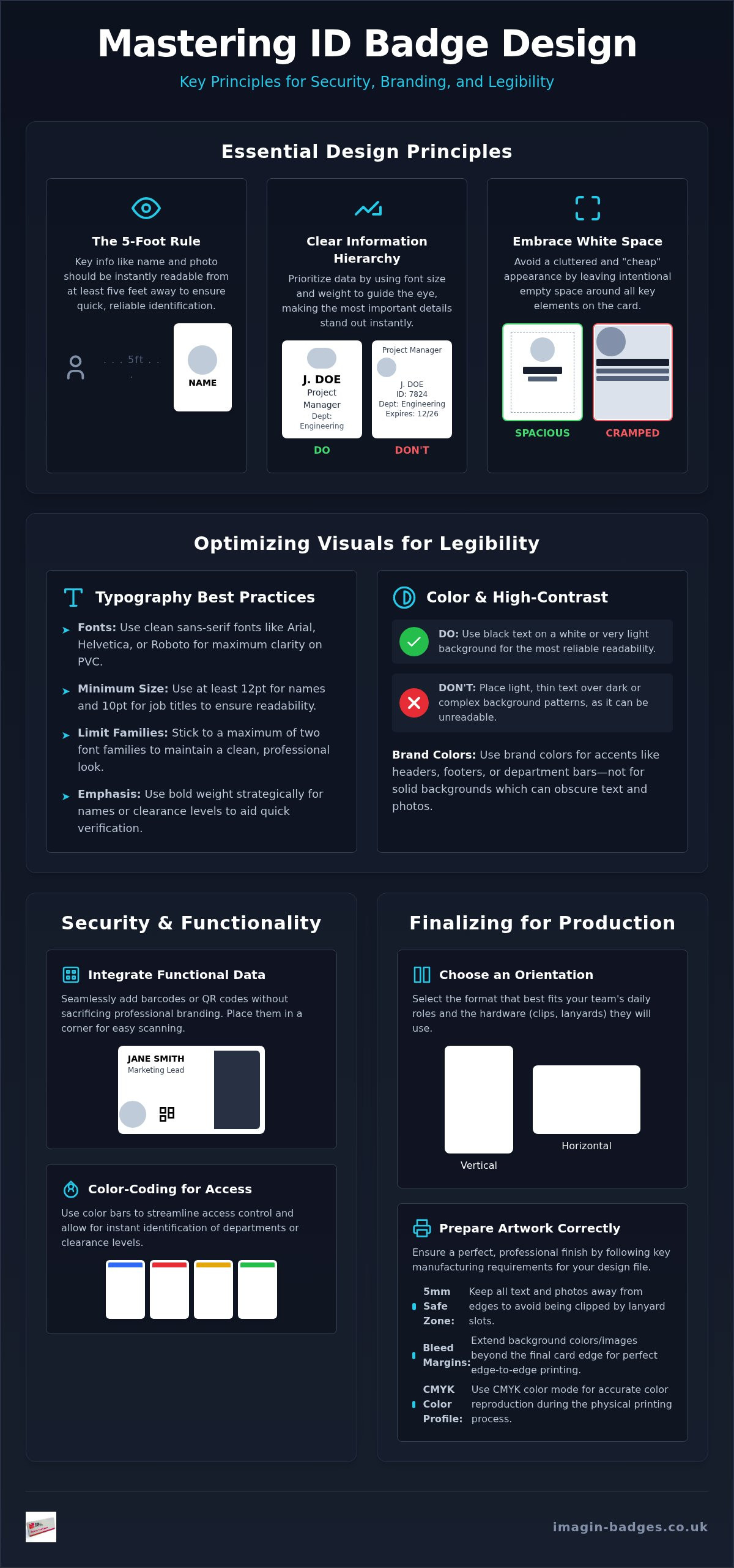
One of the most vital metrics for success is the "5-Foot Rule." Security personnel or reception staff should be able to read the primary information on a badge from at least five feet away without squinting. Achieving this requires a careful balance of white space and data. If you cram every possible detail onto the card, the result looks cluttered and "cheap." By leaving intentional empty space around the edges and between elements, you draw the eye toward the most important information. It's a hallmark of professional manufacturing that distinguishes your organization from those using basic DIY solutions.
Establishing a Clear Information Hierarchy
To make a badge functional, you must prioritize data. The cardholder's name and role are the most important elements, followed closely by a high-resolution photo. Use font weight and size to guide the viewer. For example, a bold font for the name and a standard weight for the job title creates a natural path for the eye. Secondary information, such as department names or expiry dates, should be placed toward the bottom or in a smaller font size. This ensures the viewer isn't overwhelmed by data that isn't immediately necessary for a quick visual verification. Following these id badge design tips ensures that even at a glance, the most relevant facts stand out clearly.
Aligning Badge Design with Your Corporate Identity
Professional identification should feel like an extension of your company’s uniform. You can incorporate brand colors effectively by using them for headers, footers, or color-coded department bars rather than as a solid background. Solid dark backgrounds often make black text impossible to read and can cause issues with photo clarity. Logo placement is also strategic. In a vertical layout, the logo typically sits at the top or bottom center. For horizontal designs, it often works best in a corner. It’s important to ensure these designs complement any custom name badges your team might already wear. A cohesive look across all identification hardware reinforces your brand’s attention to detail and pride in craftsmanship.
Optimising Visual Elements for Maximum Legibility
Legibility isn't just an aesthetic choice; it's a functional requirement for security. When personnel must be identified quickly, high-contrast colour schemes are essential. Black text on a white or very light grey background remains the most reliable combination for immediate readability. These id badge design tips help you avoid common "design traps," such as placing thin, light-coloured text over dark headers. While this might look modern on a high-resolution monitor, the ink can bleed slightly during the manufacturing process, making small details unreadable. Solid colours are always preferable to complex background patterns, which can create visual "noise" that interferes with both human recognition and electronic security scanning.
Typography Best Practices for ID Cards
Typography is where many DIY designs fail. Sans-serif fonts like Arial, Helvetica, or Roboto are the gold standard for identification products. They lack the decorative "feet" or serifs that can blur when printed at small scales on PVC. For maximum impact, we recommend a minimum font size of 12pt for the cardholder’s name and 10pt for their job title. You should limit your design to a maximum of two font families to maintain a clean, professional appearance. Strategic bolding is a powerful tool for security. By bolding the name or a specific clearance level, you allow security personnel to verify a staff member's identity at a glance. Aligning your typography with secure ID and data standards ensures your credentials meet the rigorous requirements for modern, interoperable identification.
Capturing and Placing Professional ID Photography
A crisp photo is the cornerstone of any professional ID card. To create a unified corporate look, you should standardise the background colour for all staff portraits. A neutral light blue or grey background works best to make the subject stand out. Lighting is equally critical. Ensure your subjects are lit from the front to avoid harsh shadows that might obscure facial features or eyes. For a sharp, professional result, all images must be captured and saved at 300 DPI. Lower resolutions often appear pixelated or "muddy" when translated from a digital file to a physical card. If you're unsure if your current staff photos or layouts meet these standards, our team offers complimentary design assistance to refine your artwork before production begins.
Beyond the photo itself, consider how it interacts with the rest of the card. Placing a photo too close to a barcode or a bright brand element can distract the eye. By following these practical id badge design tips, you ensure your badges are high-performance tools that stand up to the demands of a busy workplace. The goal is a design where the photo is the clear focal point, supported by legible text and a clean layout that reinforces your brand’s professionalism.
Integrating Security Features and Functional Data
Integrating security doesn't mean your badge needs to look like a cluttered spreadsheet. Modern id badge design tips focus on embedding functional data into the visual layout seamlessly. Whether you're managing a corporate office or looking at a complex campus ID card design, the goal is to make security features intuitive. Colour-coding is one of the most effective ways to manage access. By using a bold colour bar at the bottom or a tinted border, you can immediately identify who belongs in specific zones or departments. This reduces the burden on security staff and streamlines movement within your building.
When designing for "smart" badges, you must account for internal RFID or proximity chips. It's a common mistake to design a layout that requires a slot punch right through the internal antenna. We recommend using badge holders or designing the artwork to clearly indicate safe areas for clips. Including "Valid From" markers or clear expiry dates provides another layer of protection. This simple addition prevents unauthorised access once a contract or project has ended, ensuring your security protocols remain robust and up to date.
Effective Use of Barcodes and QR Codes
Placement is critical for scanning efficiency. While placing a barcode on the front allows for quick visual checks, moving it to the back keeps the primary brand identity clean. Regardless of placement, you must maintain a "quiet zone." This is a small area of white space around the code that ensures the scanner doesn't pick up background patterns or text. Keep the code large enough for standard hardware to read but small enough that it doesn't dominate the cardholder's photo or name. This balance ensures functionality without sacrificing the professional aesthetic of your identification products.
Visual Security Markers and Anti-Counterfeit Tips
You don't always need expensive holographic overlays for effective security. Micro-text and fine-line patterns are simple yet powerful measures that are difficult to replicate with standard office printers. Dual-sided printing is another excellent strategy. By moving security instructions and secondary data to the back, you free up space on the front for high-impact branding. Colour-coded borders are particularly useful for tiered clearance levels. For instance, a red border might signify restricted access, while a green border indicates general entry. These subtle id badge design tips ensure your badges are as secure as they are professional, providing a safe pair of hands for your organisation's security needs.
Choosing the Right Format, Materials, and Hardware
A digital layout can look flawless on a 4K monitor, but it must survive the daily wear of a physical environment. One of the most overlooked id badge design tips is considering how the physical card interacts with its hardware. Most professional ID cards follow the ISO/IEC 7810:2019 standard for dimensions, but the choice between a horizontal or vertical orientation depends on your specific use case. Vertical designs are often the preferred choice for photo-heavy cards because they allow for a larger portrait without sacrificing space for the cardholder's name. It's a simple layout shift that makes the identification process much faster for security personnel.
Material selection also plays a significant role in the final aesthetic result. Traditional PVC offers the most vibrant colour reproduction and longevity, making it the industry standard for high-capacity manufacturing. While recycled materials are an excellent sustainable alternative, they can sometimes offer a slightly different finish. Regardless of the material, you must account for the physical slot punch. Failing to leave a 5mm "safe zone" at the top of your design is a common mistake that leads to lanyards cutting directly through your company logo or critical text. It's these technical finishing processes that separate a professional badge from a DIY attempt.
Orientation and Slot Placement
Orientation affects more than just the layout; it dictates how the card behaves when the wearer is in motion. Vertical badges tend to stay centered on the chest, while horizontal badges can flip more easily if not paired with a dual-clip lanyard. When you design your artwork, ensure the name and role remain readable even if the badge rotates slightly. We always recommend keeping critical information away from the extreme edges to prevent it from being obscured by the lip of an ID card holder. This proactive approach ensures your design translates perfectly from the screen to the finished item.
Matching Design to Fastening Hardware
Your choice of fastening hardware should reflect the staff's daily environment and your brand's personality. Breakaway lanyards are essential for safety in industrial or healthcare settings, whereas magnetic fastenings provide a premium, hole-free solution for corporate teams wearing expensive suits. If your brand relies on high-visibility lanyards, ensure the card design doesn't clash with the lanyard's colour or pattern. Matching your badges with the right lanyards and ID card holders ensures a professional, end-to-end look that reinforces your brand’s attention to detail and pride in craftsmanship.
Finalising Your Artwork for Professional UK Production
The journey from a digital concept to a physical badge requires technical precision. Even the most stunning visual layout can fail if the file isn't prepared correctly for high-capacity manufacturing. One of the most essential id badge design tips is understanding the role of "bleed" and "margins." For edge-to-edge printing, your background colours and images must extend beyond the final cut line. This ensures no unsightly white borders appear if the card shifts slightly during the high-speed cutting process. We typically recommend a 3mm bleed around all sides. Similarly, keeping critical text within a safe internal margin prevents information from being obscured by the badge holder's frame.
Colour accuracy is another vital factor in professional production. Most office monitors display colours in RGB, but industrial printers require CMYK colour profiles. Converting your design to CMYK before submission ensures the physical product matches your corporate identity. Without this conversion, vibrant brand blues can appear dull, and deep reds might shift toward unexpected shades. A final technical checklist should include verifying that all images are 300 DPI, fonts are outlined or embedded, and files are saved in a high-quality format like PDF, AI, or EPS. These steps guarantee that the technical finishing processes result in a crisp, premium finish.
Preparing Your Print-Ready File
Start your project by setting your canvas to the standard CR80 dimensions, which are exactly 86mm by 54mm. Using vector logos is essential for maintaining sharpness. Unlike pixel-based images, vectors can be scaled infinitely without losing quality. This is particularly important if you're coordinating your ID cards with other branded items like Embroidered Polo Shirts or Softshell Jackets. Before you submit a bulk corporate order, double-check every name, role, and department for accuracy. A single typo can be a costly mistake when multiplied across a large team, so a final proofread is your best defence against production errors.
The Imagin Advantage: From Concept to Physical Product
At Imagin Products Ltd, we act as your creative collaborator to ensure every digital concept translates into a high-quality physical object. Our direct-from-factory production in the UK allows us to maintain strict quality control while offering the rapid turnaround times your organisation needs. We understand that not every team has a dedicated graphic designer. That's why we provide complimentary creative assistance to refine your vision and ensure your artwork meets all manufacturing standards. We've handled a vast array of designs since our founding in 1990, positioning us as a safe pair of hands for your project. You can begin your journey today by requesting a sample or contacting our team to start your custom design project.
Elevate Your Team's Professional Identity
Creating a high-impact ID badge is a precise blend of creative branding and technical manufacturing standards. By mastering visual hierarchy and adhering to the "5-foot rule," you ensure that your staff remains easily identifiable while your premises stay secure. Integrating smart features like RFID chips or QR codes doesn't have to compromise your aesthetic if you plan your layout with the final hardware in mind. Applying these id badge design tips helps you avoid common pitfalls like blurry photos or cluttered data, resulting in a product that truly represents your organisation's standards.
At Imagin Products Ltd, we're more than just a manufacturer. We're your dedicated design partner. Our UK-based facility uses durable, premium materials to ensure your badges stand up to the rigours of daily use. We offer complimentary creative assistance to guide you through the technicalities of file preparation and material selection. We're ready to bring your vision to life with the precision and care it deserves, moving your project seamlessly from initial thought to a finished item.
Design your professional ID badges with Imagin Products today and experience the reliability of expert British craftsmanship.
Frequently Asked Questions
What is the standard size for an ID badge in the UK?
The standard size for an ID badge in the UK is 86mm x 54mm, which follows the international ISO/IEC 7810:2019 standard for CR80 cards. This is the same physical footprint as a standard credit card. This specific dimension ensures that your badges will fit perfectly into all standard ID card holders, wallets, and badge reels available on the market.
What font size should I use for names on an ID card?
We recommend a minimum font size of 10pt to 12pt for the cardholder's name to ensure immediate legibility. While a smaller font might look clean on your computer screen, it often becomes difficult to read in a busy workplace or from a distance. Using a bold sans-serif typeface at this size helps the name stand out against other data like job titles or department names.
Should I choose a horizontal or vertical layout for my staff badges?
Your choice depends on the amount of text and the style of photography you intend to use. Vertical layouts are often preferred for photo-heavy designs because they provide a natural frame for a portrait. Horizontal layouts are a practical choice if you have long job titles or company names, as they offer more width to prevent the text from appearing cramped.
What is the best file format for sending my logo for printing?
Vector file formats like PDF, AI, or EPS are the gold standard for professional manufacturing. Unlike JPEGs or PNGs, vector files don't lose quality or become pixelated when they are resized. This ensures your logo remains crisp and professional whether it's printed on Photo ID Cards or integrated into the design of custom lanyards.
Do I need to include a photo on every ID badge?
While a photo is not strictly mandatory for every type of badge, it is the most effective way to prevent unauthorised badge sharing. For high-security environments, a photo is essential for quick visual verification. However, for temporary events or visitor passes, you might opt for a design that focuses on the person's name and their level of access instead.
How can I make my ID badges more secure against forgery?
You can enhance security by layering overt and covert features such as micro-text, fine-line patterns, or UV-fluorescent ink. These elements are difficult for standard office equipment to replicate. Implementing these id badge design tips creates a robust defence against forgery while maintaining a clean, professional appearance that doesn't overwhelm the primary brand identity.
What resolution should staff photos be for the best print quality?
All staff photos should be captured at a resolution of 300 DPI to ensure a sharp, professional finish. Photos taken at lower resolutions often appear "muddy" or pixelated once they are printed onto PVC. Starting with high-resolution files reduces the stress of the ordering process and ensures that the final physical product matches your original digital concept.
Can I use my brand's exact Pantone colours on my badges?
Yes, you can use your brand's specific Pantone references, though these are typically converted to CMYK profiles for the manufacturing process. Providing your colour codes early in the customer journey allows us to achieve the closest possible match. Our team provides complimentary creative assistance to help refine your id badge design tips and ensure your corporate identity is reproduced accurately.